Weighty decision
How we selected new typefaces methodically, insightfully, and oh-so joyfully
Let’s begin with the end of this story: My team and I selected LFT Etica and LFT Etica Sheriff as the new typefaces for Dictionary.com in 2023. Here’s how we made our choices.
When I joined Dictionary.com near the end of 2022 as VP of Experience Design, it was a wonderfully hectic time; things were happening. We were beginning a sitewide redesign, a refresh of our brand expression, and the construction of a tokens-based design system simultaneously.
Dictionary.com’s typography at the time was pretty much all Arial, which needs no introduction from me. Arial is highly functional and as generic as it gets, no disrespect. We believed there were more fitting typeface options for our users, our content, and our brand, which enthusiastically celebrated words and language.
One of our options was a well-designed custom typeface that Dictionary.com had commissioned a couple of years before I arrived but had not implemented. We added the custom font to our list of candidates. To my CEO’s credit, she did not require me to use it just because the company had paid for it.
So we began our journey. The selection process I outlined was considered by some to be arduous. (“Dude—you know fonts; just pick one.”) I could have just picked a typeface. I had a point of view and crushes on a few personal favs. The stakes were too high, however, and it was important that my assumptions were challenged. In the end, we did not choose my presumptive sure-bets, thank goodness. They were eliminated fairly early in our process, which, by the way, never felt arduous. It was expeditious.
Criteria
Step one in the selection process was establishing criteria to narrow our field of candidates. In addition to “we must love it,” we listed seven requirements:
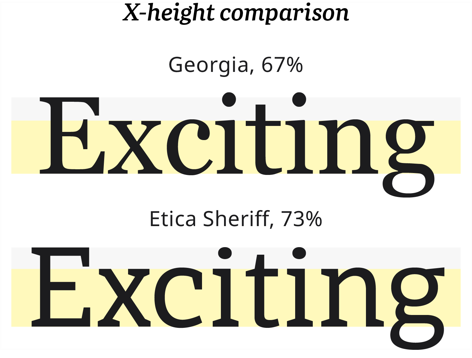
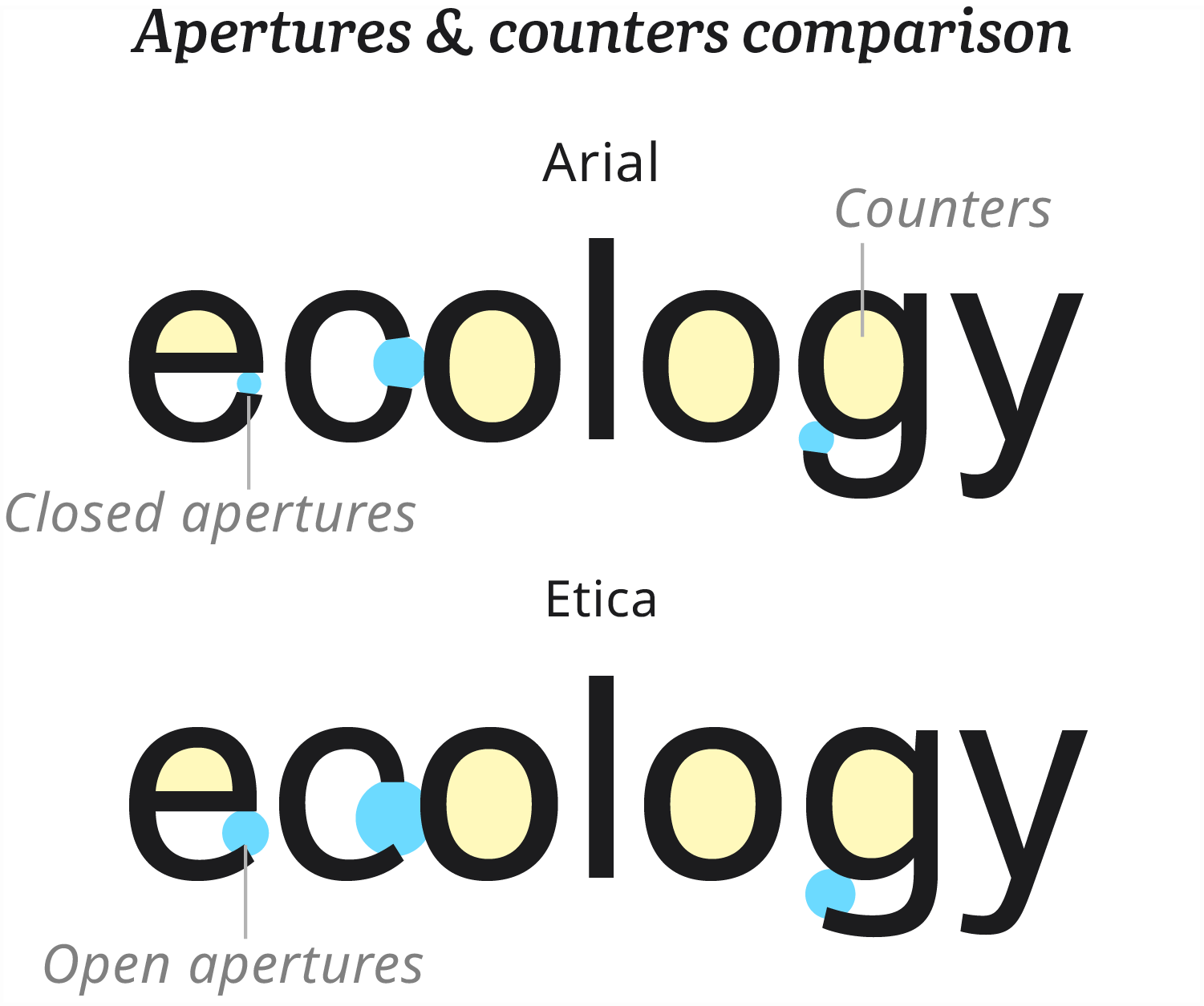
- Readability. It was the dictionary, after all; outstanding legibility and smooth readability on screens was a must, especially for body text. We priorotized high x-height (the ratio of lower-case letters to the cap height) and open apertures and counters.
- Flexible family. Because we didn’t know yet exactly how the fonts would be implemented in our burgeoning design system, we needed a typeface family that preserved options—a variety of font weights.
- Balance. Dictionary.com’s audience fell into two broad categories. The Utility Seekers were results-driven, conducting searches to find definitions, synonyms, word origins, and example sentences. This group included school students from elementary to college. The Language Lovers returned to the website often, simply for the joy and experience of words—people I’d like to hang out with. Our typefaces needed to project enough character to enrich the experience for Language Lovers without being off-putting for the Utility Seekers. Our typography also needed to appeal to a wide age range.
- Brand alignment. Typography expresses personality, voice, tone, value perception. We wanted to ensure the typefaces we chose would project our company brand attributes. Problem: We didn’t have an agreed-upon set of attributes. No worries; we facilitated a full-day workshop, including colleagues from all areas of our business, to distill a shared set words that described our brand. We aligned on: vibrant, enjoyable, pleasing, relevant, smart, and trustworthy.
- Note: Knowing your brand attributes enables you to test fonts with end users and avoid false-positives, such as fonts that test high for “likeable” and “fun” when what your business needs is “athority.” It’s nice to be liked, but there’s more to it.
- Inclusivity. Our mission statement at Dictionary.com included:
At Dictionary.com, we aspire to empower every person of every background, to express themselves, make connections, and open doors to opportunity through the power and joy of language.
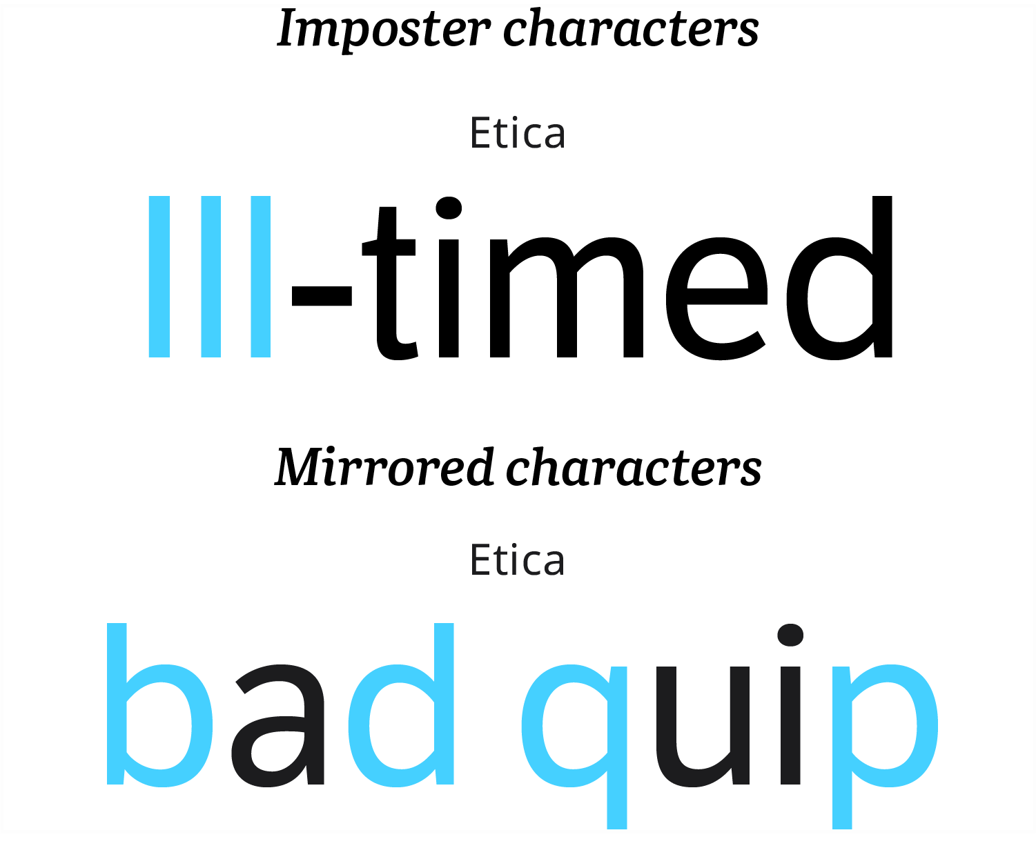
We took that mission seriously, so it was important to us that our typefaces were accessible to as many readers as possible. We prioritized clarity for readers with vision impairment and unambiguous letterforms for neurodivergient readers. We were on the lookout for mirror characters and imposter shapes. - Technical integrity. We’ve all fallen head over heels for a font only to find out it contains one quirky, frustrating flaw that keeps us awake at night, am I right? Maybe it’s a comma that looks like a period on screen, or a letter-spacing issue affecting a single character. I’m gritting my teeth just thinking about it.
- Great foundry. Your type foundry is an important partner. Their typefaces can elevate your brand and resonate with your audience. The technical integrity of their files can make life easier for your designers and engineers. Their expertise can save the day. We wanted a foundry that specializes in typefaces for editorial use, made by typeface designers who understood design considerations associated with reading long passages of text. There are outstanding fonts, made by terrific foundries, that are not meant for editorial use.
- Cost. Of course.
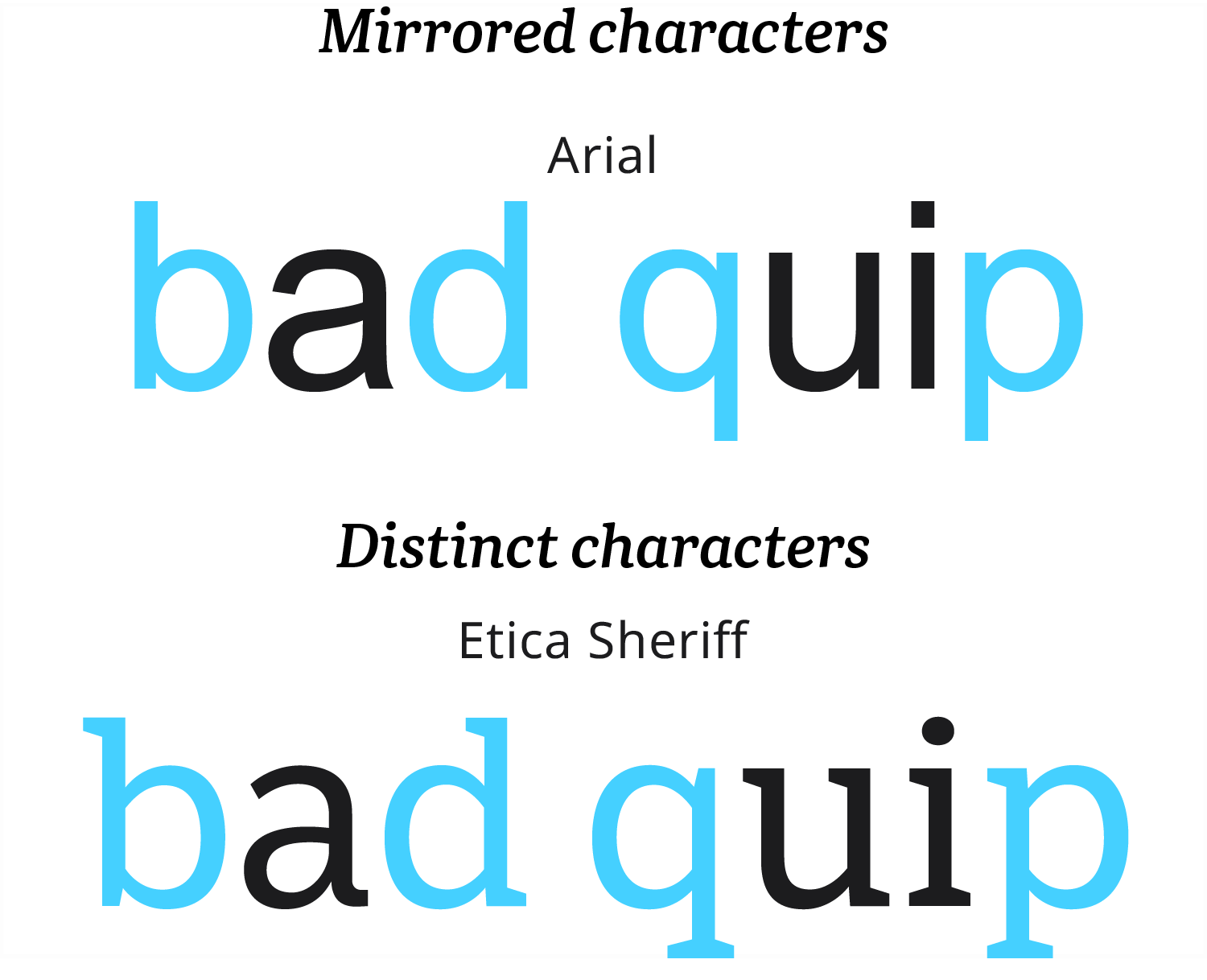
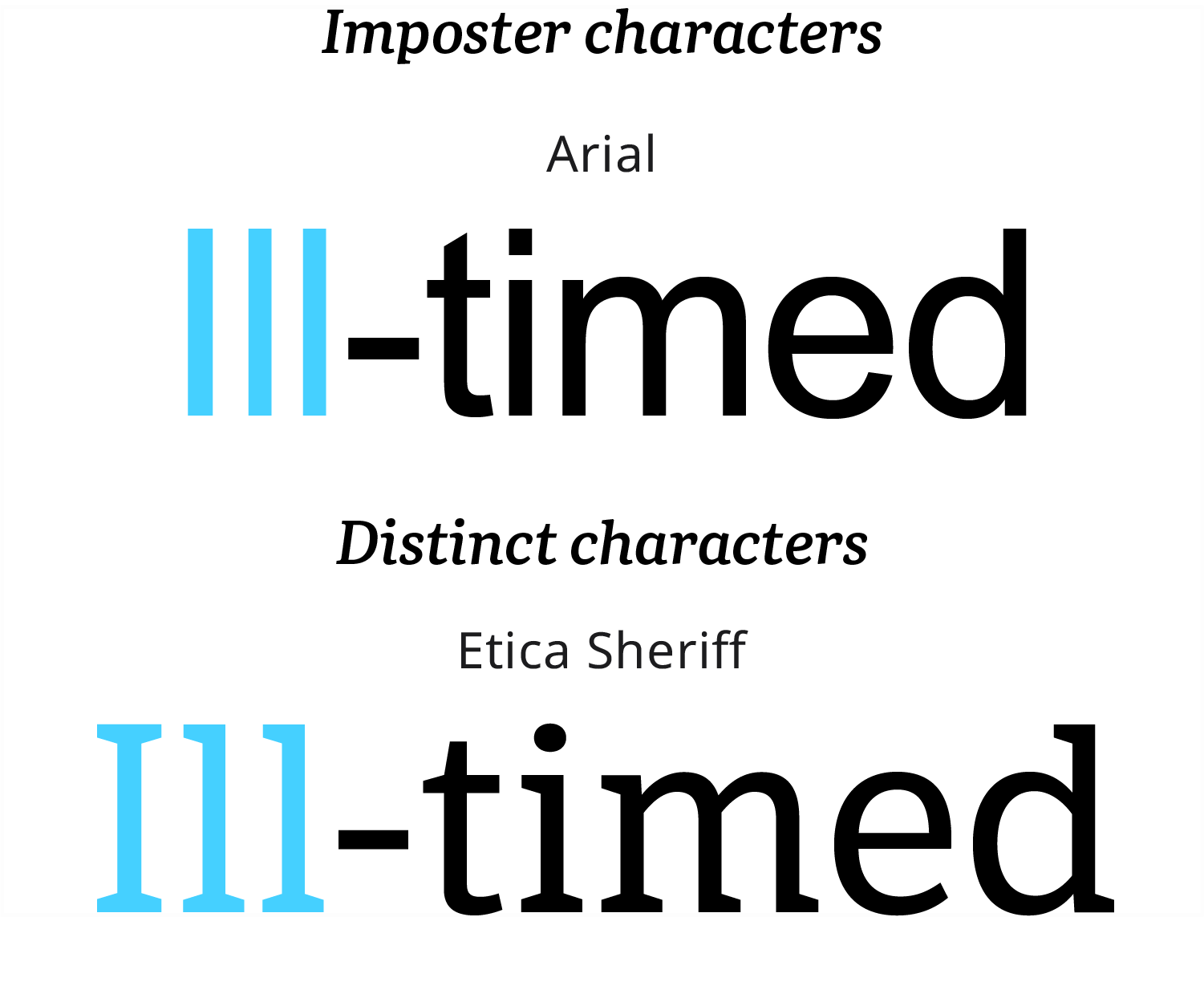
Holding to our values was a consequential decision; this requirement removed a lot of gorgeous typefaces from contention. Although many serif typefaces met our inclusivity requirement, not many sans serifs did. One of the candidates removed from our list as a result of our inclusivity requirement was our already-paid-for custom typeface.
Note: As a young design student, I learned to admire typefces that persisted shapes elegantly throughout their design. I still do. These echoes were the heart of the designs. They represented mastery of form and attention to detail. With greater understanding of the struggles that ambiguity poses to some people, I’m excited to see how new typeface designs, along with personalization in the way we engineer user experiences, will solve problems.
Nomination process
We opened typeface nominations to our entire team, socialized our requirements, and provided an extensive list of type foundries for people to review.
When nominations were complete, our brand designer, Phil Barnard, and I made a first pass at the list, eliminating typefaces that didn’t meet our criteria. Then we test-drove the remaining candidates and made a few more cuts, eventually winnowing our list to five finalists.
I know, you want me to list the finalists and show samples. Sorry to disappoint, but I won’t. They’re all good typefaces and foundries; I don’t want to publicly frame any as losers. That’s not what this story is about. Maybe privately, respectfully over a good cup of coffee some day.
Cue the humans
We had our typeface darlings during the selection process, for sure, but we were insider type geeks (unabashed); we were not our users. Our next step was to test our finalists objectively and gather feedback from a panel of readers. We constructed a study that was as unbiased as possible. In fact, we didn’t even tell the participants what we were testing. We never said the words “font” or “typeface” during the study.
We chose an article from Dictionary.com and built five versions of that article, each using a different typeface family. Everything else remained the same in all versions—content, order of content, hero image, layout, etc. We removed the Website branding to minimize status quo bias among study participants familiar with Dictionary.com.
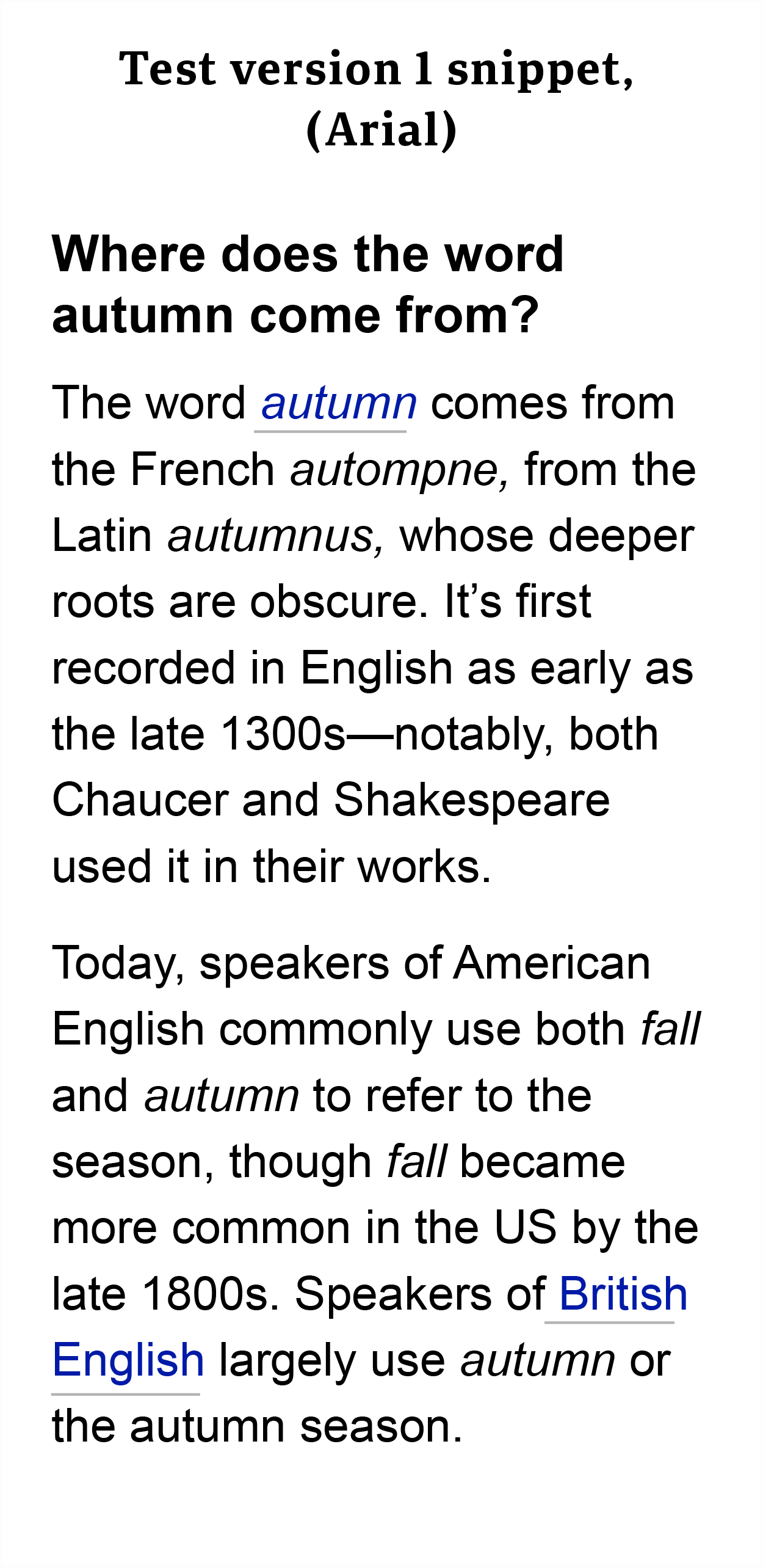
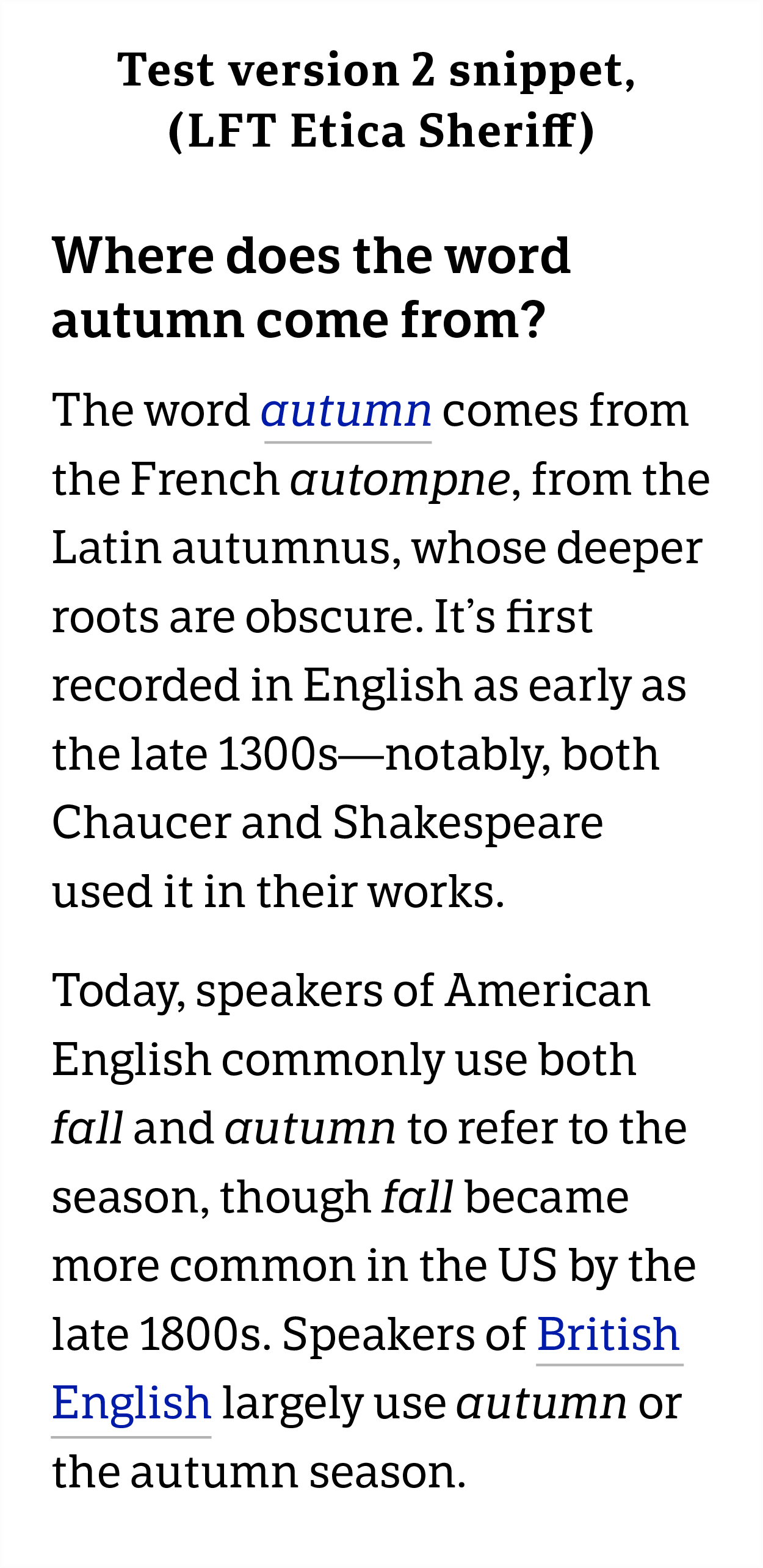
We showed each article to separate panels of study participants. When they’d finished reading, we prompted them with questions. Their responses were given using a five-step Likert scale:
- First impression: Describe your first impression when you saw the article (Very negative > Very positive)
- Quality: How satisfied were you with the quality of the article after reading it? (Poor quality > High quality)
- Look and feel: How would you rate the overall look and feel of the article? (Very unappealing > Very appealing)
- Readability: Compared to websites you visit, how legible and easy to read was this article? (Very difficult > Very easy)
Then we asked participants to choose three adjectives that best described thier percpeption of the article from a randomized list of 18 descriptors: Vibrant, Dull, Attractive, Unattractive, Pleasant, Unpleasant, Enjoyable, Unenjoyable, Trustworthy, Untrustworthy, Smart, Clumsy, Modern, Outdated, Typical, Basic, Common, and Cheap.
Results
Typeface choice had clear effect on readability and perception of the article experience.
Etica Sheriff was the top performer in readability and look-and-feel, with Etica as the runner-up. Etica came out on top in overall satisfaction and first impression, narrowly edging Etica Sheriff. Etica Sheriff had greatest alignment with out brand attributes.
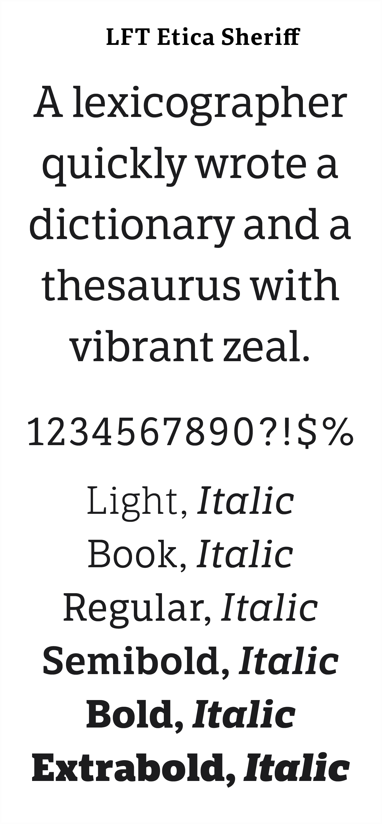
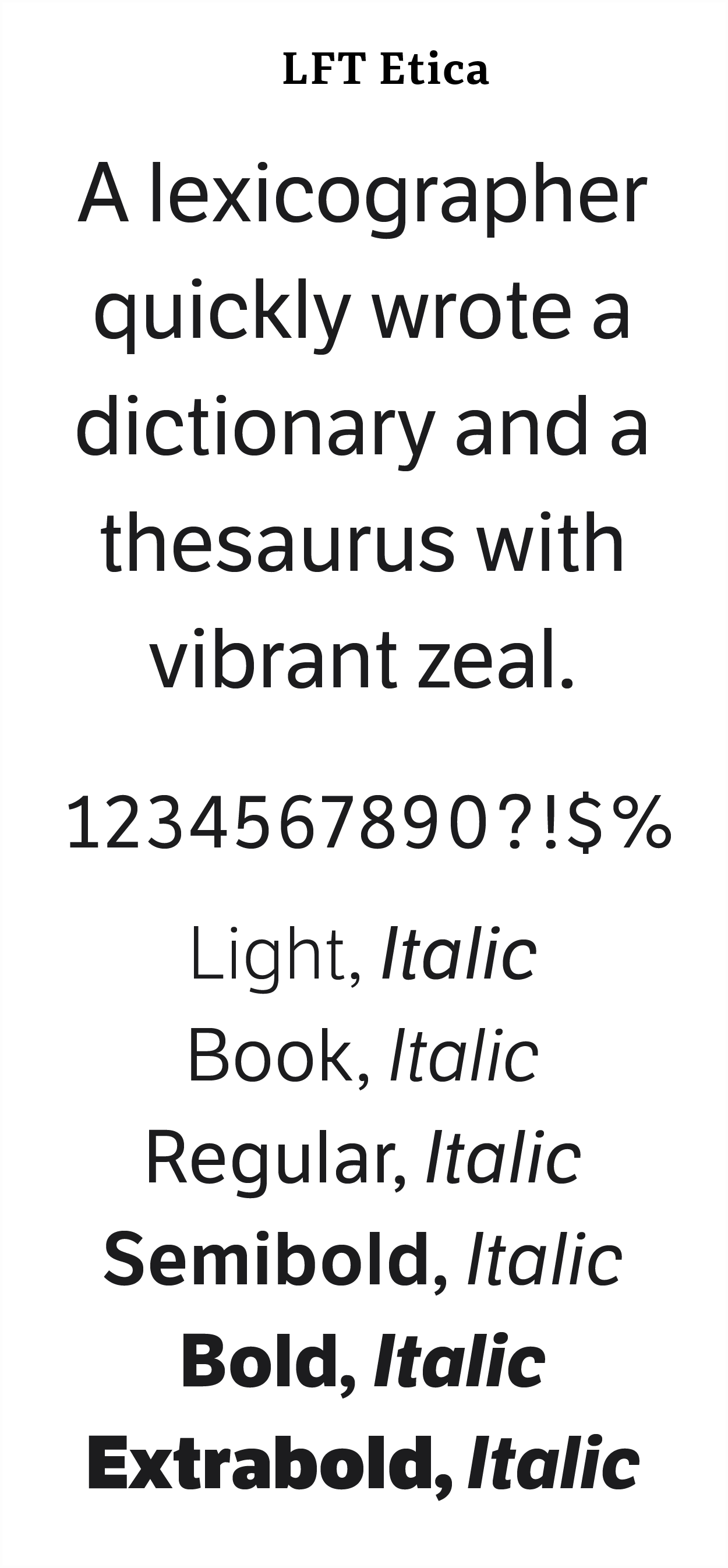
Both typeface families offered flexibility of weights in their standard packages. Additional styles—Condensed, Compressed, and Display—were available, if ever the need were to arise. We test-drove the fonts, and they handled beautifully.
Etica Sheriff fulfilled our inclusivity requirements, but Etica, like most sans serif editorial typefaces, did not (gasp). We struggled with our decision briefly, eventually deciding to move forward with Etica anyway, for two reasons:
- Etica embodied the readability traits we were looking for, and it performed very well in our readability tests.
- I discussed our inclusivity concerns with Veronika Burian, co-founder at TypeTogether, the foundry that makes Etica. We made plans to customize the fonts in 2024 to be compliant with our requirements.
This highlighted the requirement for a great partner foundry. TypeTogether already had my trust and admiration. I had partnered with them previously, licensing their Adelle Sans and Tablet Gothic families for redesign projects. I’d also contacted them occasionally with general typography questions. They’ve been pleasant, attentive, responsive, and invested in my success. While implementing a test of the Etica Sheriff and Etica families at Dictionary.com, TypeTogether was very helpful in troubleshooting a technical problem, which turned out to be on our side, not theirs.
Etica Sheriff and Etica are not free fonts. “Free” is an easy budget sell, I get it, but the fee for perpetual licenses was very reasonable. The next-level quality of the typefaces plus the value of TypeTogether’s partnership were well worth the cost.
Putting our new fonts to work
We implemented our new fonts just in time to proceed with our redesign and brand refresh work. We parsed and tokenized the fonts in our burgeoning design system. We proceeeded with confidence founded on validation and insight.
Afterword
We launched MVPs of a few segments of our redesign with Etica Sheriff and Etica, such as the homepage, definitions pages, and synonyms pages. Progress was halted when Dictionary.com was sold to new owners. As these things go, my team and I, along with most of the company, were out on our asterisks. Our new article designs didn’t launch, nor did iterative improvements on our MVPs. Our font customizations didn’t happen. Too bad. Still, though, great fonts.
Final note: You’re actually seeing some of TypeTogether’s handiwork right now; the typeface you’re reading is part of their Portada family.
Thank you for your time and your interest. Have any thoughts or questions? Drop me a note. Be well.
More
If you’d like to dig deeper into considerations for typeface selection:
- What’s in a Word?, by Gareth Ford Williams, 2021.
- Research from The Readability Consortium
- Research from Readability Matters
